Any website for a law firm or law practice needs to focus extensively on the user interface.
This is the only way in which you’ll ensure that traffic turns into leads and leads, in turn, convert into paying clients. Everybody has a website today, and it helps to stand out.
But that’s not why we want you to focus so much on your website’s UI and UX (user experience).
Good UI and UX improve your website’s SEO. They help retain more visitors. And they allow users to find what they are looking for faster and more conveniently—Thereby increasing your chances for conversions.
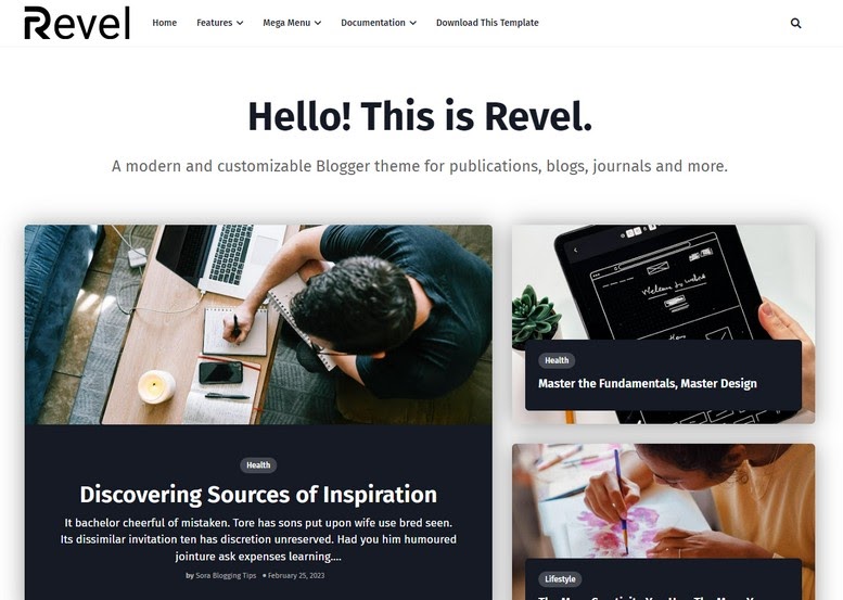
| Law Firm Website UI: Navigating User Experience for Client Conversion: eAskme |
Ensuring a good user interface goes beyond ensuring a clutter-free experience.
It also involves choosing colors and fonts correctly, having hassle-free website navigation, an intuitive hierarchy of content, branding-friendly CTAs and forms, and so on.
Exactly what you will need to change, add, or remove depends on your website, but here are some generic points to remember.
Reputable law firm marketing agencies like Grow Law Firm often provide a free consultation to get you started in finding current issues in your user interface.
Responsive Design for Accessibility:
Designing the website in a way that it’s mobile-friendly is the first step. The majority of visitors are on phones today.
It’s also the medium people are more likely to use when seeking answers to urgent legal questions.
Incidentally, it’s very important to pay attention to responsive design—Optimizing your web pages for mobile screens.
Some have graduated from that technique and are now making mobile-first websites. Thanks to thorough testing, the mobile-first approach ensures that nothing is ignored or missed.
Once the website is ready, it’s scaled up for larger screens like laptops and desktop monitors.
Mobile responsiveness ensures that law firm websites are accessible and functional across various devices, leading to improved user experience and fewer friction points when navigating the website for relevant information.
For example, if a website is designed for the desktop first and mobile later, it might have landscape banners that appear too small on mobile screens, a hefty footer that never ends, or a menu that simply breaks down on smaller screens.
Mobile-first websites don’t have these problems.
Engaging Visuals and Branding:
There’s a reason why the top bankruptcy lawyer websites use pictures of banks and not lawyers or a court.
It’s the same reason why a page on family law uses the picture of a smiling person rather than a troubled one.
It’s important to connect the visitor and what they want—And certain visuals connect better.
Better visuals and branding create a more professional and credible website. It’s the other half of the website, the first half being the text.
However, visuals and branding don’t end with your pictures, logo, colors, and fonts.
Use icons, for example, to accentuate otherwise bland text sections, or use an opposite color to create contrast for your CTA section.
The more you look at other great websites (not just those in the legal sector), the more you will learn how to use branding and visuals for a better impact.
You’ll quickly notice a pattern if you check out the best personal injury lawyer websites. They offer clear website navigation and an intuitive content hierarchy or layout.
The user doesn’t have to look around a lot just to find a section or page they need. Visual aids help and should be used to better display your content.
Readability and Accessibility:
Clear and concise content is essential for delivering the firm’s message effectively.
Readability and accessibility considerations, such as font choices and contrast, impact user experience and ensure visitors can absorb information effortlessly.
The best way to ensure both is to extensively test the website on multiple devices with different platforms and browsers.
How a website appears on Google Chrome on a Windows 11 desktop PC can differ from an iPhone 12 Mini’s Safari.
Different operating systems and browsers render fonts and CSS slightly differently, and it’s not rare for the output to differ from what is intended on certain screens.
Accessibility mainly concerns meeting minimum requirements to make it easy for non-visual devices like screen readers to function effectively.
The message of your website should not get lost just because someone is visually impaired. For example, the screen reader has no context if images are not tagged with alt descriptions.
We’d be remiss not to mention the importance of relevance here. Not all websites need to spend a lot of effort in ensuring accessibility.
Websites that are smaller or only have a handful of pages should rather focus on improving other aspects and fleshing out the websites before they move on to web accessibility.
For example, family lawyers firm websites that are small should start a blog section about family law.
Even then, they will most likely have less than a hundred pictures.
Trying to follow all accessibility standards, such as ensuring an ideal website for screen readers, will only discourage you further.
It’s best to first aim for good traffic and content; the rest can follow.
Conclusion:
Hopefully, now you have a better idea about user interfaces, some actionable intelligence to use, and a direction to follow.
But just ensuring good UI and UX will not cut it! There are a lot of considerations when it comes to improving the overall experience of your website for potential clients, and these steps can take a while to get right.
You can learn more here – Reading guide about SEO for lawyers.
Still have any question, do share via comments.
Share it with your friends and family.
Don’t forget to join the eAskme newsletter to stay tuned with us.
Other handpicked guides for you:


